info@good-hair.ru +7(495) 782-63-23; +7 (499) 726-39-16 Москва, ул. Ярцевская, д. 22а корп. 2., Второй этаж

Sing in

or account in social networks

Coming Soon / Offline Page

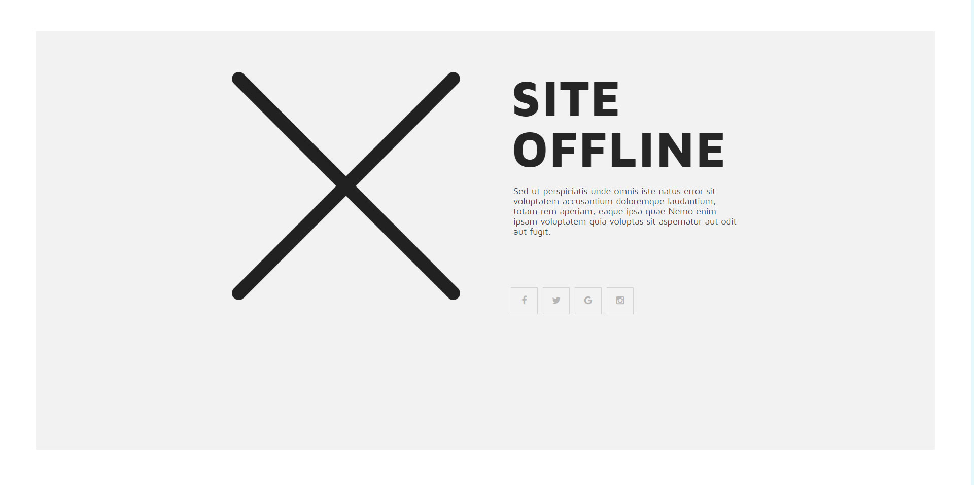
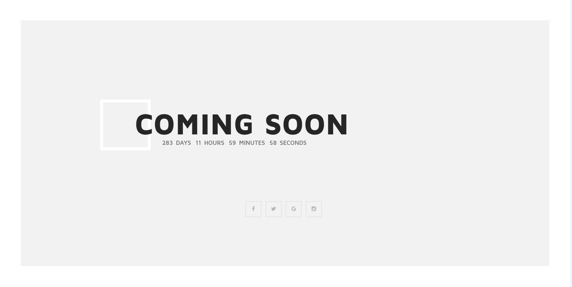
YourFitnes Template have a minimal, creative and responsive HTML5 offline page. Select how to display offline page in theme settings. Use one of the modes: Offline page or Coming Soon page.

Main Features Ofline page

  • Two modes: Offline page, Coming Soon page
  • Clean and minimal design
  • Fully Responsive
  • jQuery Countdown for Coming Soon page
  • Easy to customise
  • 600+ Google Fonts
  • W3C Valid HTML
  • Well documented PHP and LESS files
  • and more features...
Offline Page


Grand Opening (Coming Soon) Page

Timepicker

Create a timepicker which can easily be used by selecting a time value from a pre filled dropdown.

Usage

To apply the timepicker, just add the data-uk-timepicker attribute to an <input> element. The timepicker will automatically display a pre filled dropdown on focus, which can be navigated by pressing the up or down button on the keyboard or by scrolling with the mouse.

IMPORTANT The timepicker component requires the Autocomplete component in order to work. Please make sure that you always include them together.

Example

Markup

<form class="uk-form">
    <input type="text" data-uk-timepicker>
</form>

Display meridian time

To display meridian time, just define the format option and set it to 12h

Example

Markup

<form class="uk-form">
    <input type="text" data-uk-timepicker="{format:'12h'}">
</form>

JavaScript options

This is an example of how to set options via data attribute:

data-uk-timepicker="{format:'12h'}"
Option Possible value Default Description
format '24h' or '12h' '24h' Defines the preferred time notation
start Integer between 0 and 24 0 Start time
end Integer between 0 and 24 24 End time

Init element manually

var timepicker = UIkit.timepicker(element, { /* options */ });

Datepicker

Create a toggleable dropdown with an datepicker.

Usage

To create a datepicker, just add the data-uk-datepicker attribute to an <input> element. You also have the possibility of customizing the date format. Just add the format option to the data-uk-datepicker attribute.

The datepicker detects whether the JavaScript from the Form select component is being loaded. This allows you to quickly toggle between years and months through a select form inside the datepicker.

Example

Markup

<form class="uk-form">
    <input type="text" data-uk-datepicker="{format:'DD.MM.YYYY'}">
</form>

JavaScript options

This is an example of how to set options via attribute:

data-uk-datepicker="{weekstart:0, format:'DD.MM.YYYY'}"
Option Possible value Default Description
weekstart integer (0..6) 1 Start of the week
i18n JSON object { months:['January',...], weekdays:['Sun',..,'Sat'] } Language string definitions
format any combination of DD, MM and YYYY 'YYYY-MM-DD' Date format string
offsettop integer 5 Offset to the input value
minDate bool (false to ignore the option)
string (date as in format)
integer (offset in days from current date)
false Min. date
maxDate bool (false to ignore the option)
string (date as in format)
integer (offset in days from current date)
false Max. date
pos 'auto', 'top', 'bottom' 'auto' Position of the datepicker

Init element manually

var datepicker = UIkit.datepicker(element, { /* options */ });

Events

Name Parameter Description
show.uk.datepicker event On datepicker dropdown show
hide.uk.datepicker event On datepicker dropdown hide
update.uk.datepicker event On calendar rendering

Tooltip

Easily create a nicely looking tooltip.

Usage

To apply this component, add the data-uk-tooltip attribute to an element. You also need to add a title attribute, whose value will represent your tooltip's text.

Example

Hover me

Markup

<button class="uk-button" data-uk-tooltip title="">...</button>
<span data-uk-tooltip title="">...</span>

Alignment

Add one of the following options to the data-uk-tooltip attribute to adjust the tooltip's alignment.

Attribute Description Example
pos:'top' Aligns the tooltip to the top.
pos:'top-left' Aligns the tooltip to the top left.
pos:'top-right' Aligns the tooltip to the top right.
pos:'bottom' Aligns the tooltip to the bottom.
pos:'bottom-left' Aligns the tooltip to the bottom left.
pos:'bottom-right' Aligns the tooltip to the bottom right.
pos:'left' Aligns the tooltip to the left.
pos:'right' Aligns the tooltip to the right.

Markup

<button class="uk-button" data-uk-tooltip="{pos:'bottom-left'}" title="">...</button>

JavaScript options

This is an example of how to set options via attribute:

data-uk-tooltip="{pos:'bottom-left'}"
Option Possible value Default Description
offset integer 5 Offset to the source element
pos string 'top' Tooltip position
animation boolean false Fade in tooltip
delay integer 0 Delay tooltip show in ms
cls string '' Custom class to add on show
activeClass string 'uk-active' Toggled active class